Thursday, June 25, 2015

Movie Day!

You walk into 7th grade Biology and at the front of the room is a big tube TV on a black rolling cart. A buzzed excitement fills the classroom – you know what that TV means – it’s a movie day! Whether it’s because you have a substitute, or because your teacher just really isn’t feeling it, you don’t care, because today’s curriculum is going to be taught by Bill Nye.

Well, this teacher is getting overwhelmed with preparing to sell at the Corn Hill Arts Festival, so a movie day it is!

Today I am presenting to you the German film Die Abenteuer des Prinzen Achmed (The Adventures of Prince Achmed) by Lotte Reiniger. There are lots of reasons that this movie is really cool:


1. Lotte Reiniger is a lady. 

2. Her animation studio only had five staff members!1

3. Lots of people think Disney’s Snow White is the first full length animated movie, but The Adventures of Prince Achmed came out 11 YEARS before Snow White! (1926)2

4. The movie is a great example of Neo-platonic beliefs. The villain is boney and hook-nosed while the protagonists are the most realistic – humanizing them in comparison to the stylized supporting characters.


5. I wrote about Reiniger’s film in my senior thesis as a bridge between Wayang Kulit shadow plays and modern animation. She used stop-motion photography and cut paper on a backlight screen to produce an animation very similar to shadow puppet performances. While you watch the movie, try to imagine the meticulous work that had to go into constructing each frame.


P.S. this is a silent film and the caption screens are in German, but, you should still have no problem following the narrative and there are tons of plot summaries online.

Enjoy!


(1926) Lotte Reiniger - 'The Adventures of... by FILMandCLIPS

Notes:

1. Rachel Palfreyman, "Life and Death in the Shadows: Lotte Reiniger's Die Abenteuer des Prinzen Ahmed," German Life and Letters 64, no. 1 (January 2011): 13.
2. Palfreyman, "Life and Death in the Shadows," 6-11.

Thursday, June 18, 2015

Selfies 101: Lessons from Van Dyck

Still from A Self Portrait Shoot
The word “propaganda” usually evokes a whole array of negative connotations and associations. But, political undertones aside, we all create daily propaganda through the pictures and words we choose to post on social media. We handpick our best selfies from cellphone “photoshoots” and feel a little offended when friends tag unflattering photos of us. We self-curate our photo albums to show our ideal selves – sharing the highlights of our lifestyle, personality, and appearance. Some of the most well composed “selfies” come from the self-timer photographs of fashion bloggers. As representations of in-style fashion, these bloggers must always appear “on”- always putting their best foot forward.

Kings and Queens throughout history needed to be just as “on”. They needed successful propaganda to emphasize their social status and to legitimize their rule. In the 17th century, King Charles I of England favored Sir Anthony van Dyck as his court artist.1 Van Dyck revolutionized the standard for portraiture by abandoning the flat, icon-like portraits of his predecessors, and instead creating regal and realistic depictions of the court population. He captured the character of his sitters and elevated them to peak levels of nobility, both in body and mind – who wouldn’t want a painter like that at their beck and call?
Charles I at the Hunt by Anthony van Dyck (1635) 
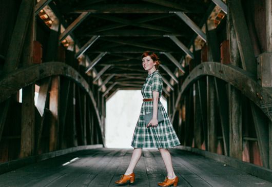
Charles I was somewhere between 5’1 and 5’5, but he appears tall and stately in his portraits by Van Dyck. Van Dyck painted his portraits with a simple formula to strengthen the appearance of his sitters. These same tricks can be used to compose the perfect #ootd (outfit of the day.) When browsing my favorite fashion blog, The Clothes Horse, I found that fashion blogger, Rebecca, (whom is also 5’1) already implements many of Van Dyck’s portrait elements.

Low Point-of-View/ Horizon Line

Outfit: Woodland
In the majority of Van Dyck’s portraits, the viewer is placed at a low point-of-view. This means that we are looking up at the subject instead of at their eye level. In court portraiture, the low point-of-view has two purposes: to make the subject appear tall and lean, and to remind the viewer that they are inferior – emphasizing the royalty of the subject. In Charles I at the Hunt, Charles looks down his nose at the viewer, an obvious sign of his social status. A low horizon line is inherent with a low point-of-view. See how the land and water ends below Charles’ hips? This contributes to his assumed height – whereas a horizon at his shoulders or higher would dwarf him in comparison to the landscape.

As a self-timer photographer, Rebecca must work within the confines of her tripod – which can only go so high while still supporting the weight of her camera. Luckily, this height restraint provides her with the same low point-of-view and low horizon line of Van Dyck. Look at Rebecca’s photo – see how the ground line ends around her hips? Although not quite as low as Charles’ portrait, the viewer is still looking up at Rebecca, easily skewing what we might think 5’1 looks like.

Casual Disarray

Photo Tip Tuesday: Posing
Casual disarray (also: studied disarray) is a term relating to a popular Baroque pose. In casual disarray the subject is posed in ease and comfort – typically with a hand on their hip. This pose is often paired with an air of arrogance and is again used as a reminder that the viewer is inferior to the subject. In Charles I at the Hunt, Van Dyck paints Charles with his hand on his hip and pushes his elbow out into the viewer’s space. This keeps us from “entering” the composition, creating a royal “bubble” in which Charles exists, but we do not. Arrogance aside, casual disarray allows the subject to appear more natural than they would in a tight, static posture. In Rebecca’s photo tip series, she talks about finding a signature pose – one that feels natural to your own mannerisms. Unnatural poses usually result in stiffness and awkward photographs. It is important to feel comfortable in front of your camera – or at least look like you do.

Hints to Lifestyle (aka Props)

James Stuart by Anthony van Dyck (ca. 1633-35)
Charles I was not very kingly – he preferred to be hunting or reading. His reign was known as the court of leather and lace – as evident in the fabrics of his outfit. Although he is dressed too lavishly for a hunt, he is not in the royal trappings of a king. Instead, he is depicted as “the first among gentleman,” carrying a sword and gloves customary of the landed gentry.

One of Van Dyck’s favorite props was a dog – especially long, lean, hunting dogs like the one in the portrait, James Stuart. Tall dogs like this one actually help the subject appear taller. The dog’s long legs insinuate his height, and since his head only comes to the hip of James Stuart, Stuart must be a very tall man – or at least Van Dyck has you thinking so. Dogs are also a symbol of loyalty, encouraging citizens to feel the same “dumb adoration” you see in the dog’s gaze.

Photo Tip Tuesday: Posing
Rebecca’s photo tips also recommend props. She likes to incorporate her vintage camera collection into her photos. Props can make you feel more comfortable in front of the camera by giving you something to do with your hands. Try to use props you’d naturally be seen with to give a hint about your life or personality. Books, purses, or a favorite treat always make good props. And I know I’ll never complain if I there is a puppy involved.

Movement and Energy

Outfit: In like a Lion
After the strict order of the High Renaissance, Mannerist and Baroque painters longed for movement in their compositions. Paintings in the High Renaissance were based on a grid, so by simply adding diagonals, Baroque painters were already providing more energy than their predecessors. Van Dyck added his diagonals with folds of drapery at the side of the composition. In Charles I at the Hunt, the horse and the trees bend towards Charles. Although these elements provided needed diagonals, they ultimately still emphasize Charles as king. The trees bend to protect him while the horse’s pose is taken from a nativity scene tradition – the horse is bowing to Charles in the same way painters showed the mules bowing to Jesus in the manger. 17th-centruy viewers would immediately recognize this reference. Modern day fashion bloggers take pictures mid-jump and mid-twirl to show movement in their photographs.

All Together Now

Marchesa Elena Grimaldi Cataneo
by Anthony van Dyck (1623)
Check out this photo by Rebecca. When I saw this picture I felt like I found the modern compilation of Van Dyck’s portrait techniques. First, look at the horizon line – the visible part of the bridge ends at Rebecca’s knees. With the low point-of-view, Rebecca looks tall and elegant. Like the portrait of Charles I, this elegance is paired with a casual air. She is natural and smiling while mid-walk as if we caught her in-the-moment. This is definitely giving off a mood – though in this case it’s much more approachable than the arrogant aim of Van Dyck. She’s even holding a book, which today would just insinuate that she’s a bookworm. Back in the 17th century, a woman painted with a book meant that she was actually literate – usually a luxury of the wealthy. And check out all those diagonals in the background! To top it off, Rebecca is featuring an element of Van Dyck that I haven’t even mentioned! When painting women, Van Dyck sometimes used a row of buttons down their dresses to make them appear long and lean by creating a vertical line. Rebecca’s dress features a button front, giving just that much more length to her assumed height. 


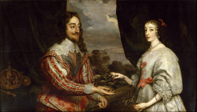
Charles I of England and Queen Henrietta Maria
by Anthony van Dyck (1632)
Van Dyck’s paintings have definitely passed the test of time as it is through his portraits that Charles I and Henrietta Maria are remembered today.3  He set a new precedent for portraiture, which court painters followed for years after him. And as you’ve just seen, his techniques are still relevant to compositions today. If you are interested in even more ways to optimize your selfies, check out The Clothes Horse’s full photo tip series here.

Notes:
1.  Christopher Brown, Van Dyck (Ithaca, NY: Cornell University Press, 1983), 144.
2. Brown, Van Dyck, 224.
3. Brown, Van Dyck, 162.

Resources:
Doot Bokelman, "Art History Survey II" (lecture, Nazareth College, Rochester, NY, Spring 2012).
Doot Bokelman, "17th Century Baroque Art" (lecture, Nazareth College, Rochester, NY, Spring 2014).


Related Recommendations: 


Thursday, June 11, 2015

The Problem with Produce

Home Food Safety

I have been officially moved out of my parents’ house for a little over a year now. One of the struggles I still face in my independent life is wasting food. My boyfriend and I go to the grocery store with the best intentions of a weekly meal plan, but sometimes that produce just never gets used, and into the trash it goes – along with the money spent on it. Living with the modern convenience of a refrigerator, I find myself putting anything and everything in the fridge to keep it from spoiling. However, many fruits and vegetables actually store better outside of the fridge. There are so many rules on what goes in the fridge, what stays out, and which fruits and vegetables can’t be kept with others – I just can’t retain it all! I’m slowly learning, but until I’m certain, I’ll keep referring to some handy infographics.

When I pull a wilted cabbage from the crisper, you can bet that the last thing I am thinking is ooh, how artistic. However, Juan Sánchez Cotán was able to transform rotting produce into a swooping, energetic composition that was characteristic of the 17th-century Baroque movement.

Obviously, there were no refrigerators in Spain during the 1600s. The Spanish people kept their fruits and vegetables in basements or dark cupboards. They often hung their produce to slow the rotting process since fruits and vegetables will bruise and soften where they rest. Cotán used this practice to his advantage, hanging the fruit to create a C-shaped arc – adding needed movement to his composition.

 
Quince, Cabbage, Melon and Cucumber by Juan Sánchez Cotán ca. 1602 


According to my favorite food sources, the produce in Cotán’s painting, Quince, Cabbage, Melon, and Cucumber, would all do the best in a refrigerator. Because all he had was a dark cupboard, it’s only natural that you can see the decay on Cotán’s food – especially in the curling leaves of the cabbage and the bruised quince. In Italy, it was common practice to idealize all elements in a painting, meaning these fruits and veggies would be at peak ripeness. Caravaggio, an Italian Baroque painter, broke this tradition. Influenced by the Northern European interest in surfaces, Caravaggio became a pioneer of Naturalism in the South. He spent some time painting in Naples, which was ruled by Spain. (Let’s not mention that he was in Naples to flee arrest for murder.) The viceroy shipped Caravaggio’s paintings to Spain, and painters like Cotán quickly adopted his realistic style.

Cotán’s naturalism also played to another influence – that of St. Ignatius of Loyola. St. Ignatius wrote a book called Spiritual Exercises, which spelled out practices for daily devotion. He taught that a devotional image of art should spark the five senses to help a person visualize all aspects of a saintly life. New to Catholicism, Spain was eager to adopt the ideas of St. Ignatius and heavily patrolled for heresy (Spanish Inquisition, anyone?). Although not inherently religious, Cotán’s painting works to engage the senses. By slicing the melon, he invites the smell of a fresh cantaloupe. Can you imagine biting into that juicy slice? What about the crunch of the cucumber? Can you recall the feeling of a wilted cabbage leaf between your fingers? Do you smell the sickly sweet of the rotting quince? Take a minute to connect to the painting and see what memories pop up.


Sources:
Doot Bokelman, "Art History Survey II" (lecture, Nazareth College, Rochester, NY, Spring 2012).
Doot Bokelman, "17th Century Baroque Art" (lecture, Nazareth College, Rochester, NY, Spring 2014).

Thursday, June 4, 2015

Boiled Bunnies = Art History?

On the first day of my first art history class, I learned about boiled bunnies. Ok, what I really learned was that in Europe during the late 14th Century, boys as young as 8 were sent to live with artists to work and learn as apprentices. These novice boys were assigned the task of making gesso to whitewash and smooth the wood panels used for painting. And what is gesso? A mixture of limestone and rabbit skin – or as my professor called it – bunny glue. The rabbit skin was used as a binder, similar to other animal-based glues. By boiling the limestone and rabbit skin together apprentices could create the liquid gesso. (Don’t worry; a quick Google search will give you tons of vegan gesso substitutes.)

My professor’s playful expressions kept class interesting and made important facts easier to retain. I will never forget the “boiled bunnies” lesson, and I want to make art history just as memorable for other people. Check out my About page to learn more about how this blog got its name. But, for now, here’s a recap of that first “boiled bunnies” lesson.

Our Setting


The art movement occurring in Europe during the late 14th Century was known as the International Gothic Style. At this time, the Church was the notable economic, social, and political power, and thus the main consumer of art. Altarpieces were commonly commissioned as a visual for the illiterate masses to focus on while the priest preached in Latin – the language of the educated. If you were stuck in a stuffy room and forced to listen to gibberish for hours, you’d want something to look at too. The Church used this as an opportunity to emphasize their core theologies through didactic imagery.


The Creation of an Altarpiece


1. An 8 year-old boy is sent to live and work with a master painter. He is given one pair of shoes and two shirts for his 10 years as an apprentice.

2. His first task is to cut down a tree. The wood is put in a smokehouse for 7-10 years to cure (dry.) 

3. Dry panels are prepped with the gesso that the apprentice made from his boiled bunnies.

4. The young apprentice is sent to the apothecary for pigment stones. He grinds them into a powder and mixes them with linseed oil to make paint. Oil paint would spoil quickly, so the apprentice had to be careful to only mix what was needed for the day.

5. The master painter draws an under-drawing on the prepped panel according to the patron’s request.

6. Older apprentices paint the initial layers, which use more oil and less pigment, known as a wash or glaze. The layers are gradually built up. Each layer takes up to a week to dry.

7. The master paints the final layers and finishing touches with pigment-rich paint.

8. The altarpiece dries for a year, is varnished, and then sent to the patron. 

Final Thoughts

The artistic workshop was common well into the Renaissance. Patrons were well aware that they were paying simply for the master’s idea, while knowing he would likely never touch the painting itself. Sometimes, prices were negotiated based on how much work the master was personally going to put into the painting. 

Since this was my first lesson in art history, I simply accepted the workshop process as historical fact. But now, I can’t think about historic art workshops without connecting them to Jeff Koons. I cannot ignore that people still revere the historic painters that worked in this way, yet contemporary workshop artists, like Jeff Koons, are freely criticized for profiting off the work of their studio artists. Koons takes all the credit for his workers, but most historic workshop artists also go unnamed unless they were a favorite assistant or went on to be masters themselves. I guess the major difference is that master painters were teaching their apprentices along the way, while Koons is only the “idea man” and depends on sourcing his projects to skilled artists to see his vision come true. I am still torn on the issue, so if you have an opinion, please indulge me in a discussion below.


Sources:
Doot Bokelman, "Art History Survey II" (lecture, Nazareth College, Rochester, NY, Spring 2012).