The
word “propaganda” usually evokes a whole array of negative connotations and
associations. But, political undertones aside, we all create daily propaganda
through the pictures and words we choose to post on social media. We handpick
our best selfies from cellphone “photoshoots” and feel a little offended when
friends tag unflattering photos of us. We self-curate our photo albums to show
our ideal selves – sharing the highlights of our lifestyle, personality, and
appearance. Some of the most well composed “selfies” come from the self-timer
photographs of fashion bloggers. As representations of in-style fashion, these
bloggers must always appear “on”- always putting their best foot forward.
Kings
and Queens throughout history needed to be just as “on”. They needed successful
propaganda to emphasize their social status and to legitimize their rule. In
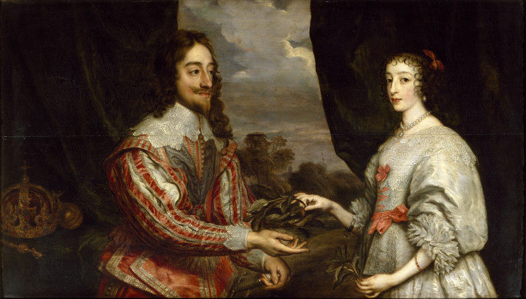
the 17th century, King Charles I of England favored Sir Anthony van
Dyck as his court artist.1Van Dyck
revolutionized the standard for portraiture by abandoning the flat, icon-like
portraits of his predecessors, and instead creating regal and realistic
depictions of the court population. He captured the character of his sitters
and elevated them to peak levels of nobility, both in body and mind – who
wouldn’t want a painter like that at their beck and call?2
Charles
I was somewhere between 5’1 and 5’5, but he appears tall and stately in his
portraits by Van Dyck. Van Dyck painted his portraits with a simple formula
to strengthen the appearance of his sitters. These same tricks can be used to
compose the perfect #ootd (outfit of the day.) When browsing my favorite
fashion blog, The Clothes Horse, I found that fashion blogger, Rebecca, (whom
is also 5’1) already implements many of Van Dyck’s portrait elements.
Low Point-of-View/ Horizon Line
In
the majority of Van Dyck’s portraits, the viewer is placed at a low
point-of-view. This means that we are looking up at the subject instead of at
their eye level. In court portraiture, the low point-of-view has two purposes:
to make the subject appear tall and lean, and to remind the viewer that they
are inferior – emphasizing the royalty of the subject. In Charles I at the Hunt, Charles looks down his nose at the viewer,
an obvious sign of his social status. A low horizon line is inherent with a low
point-of-view. See how the land and water ends below Charles’ hips? This
contributes to his assumed height – whereas a horizon at his shoulders or
higher would dwarf him in comparison to the landscape.
As
a self-timer photographer, Rebecca must work within the confines of her tripod
– which can only go so high while still supporting the weight of her camera.
Luckily, this height restraint provides her with the same low point-of-view and
low horizon line of Van Dyck. Look at Rebecca’s photo – see how the ground line
ends around her hips? Although not quite as low as Charles’ portrait, the
viewer is still looking up at Rebecca, easily skewing what we might think 5’1 looks
like.
Casual
Disarray
Casual
disarray (also: studied disarray) is a term relating to a popular Baroque pose. In
casual disarray the subject is posed in ease and comfort – typically with a
hand on their hip. This pose is often paired with an air of arrogance and is
again used as a reminder that the viewer is inferior to the subject. In Charles I at the Hunt, Van Dyck paints
Charles with his hand on his hip and pushes his elbow out into the viewer’s
space. This keeps us from “entering” the composition, creating a royal “bubble”
in which Charles exists, but we do not. Arrogance aside, casual disarray allows
the subject to appear more natural than they would in a tight, static posture.
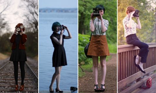
In Rebecca’s photo tip series, she talks about finding a signature pose – one
that feels natural to your own mannerisms. Unnatural poses usually result in
stiffness and awkward photographs. It is important to feel comfortable in front
of your camera – or at least look like you do.
Hints
to Lifestyle (aka Props)
Charles
I was not very kingly – he preferred to be hunting or reading. His reign was
known as the court of leather and lace – as evident in the fabrics of his
outfit. Although he is dressed too lavishly for a hunt, he is not in the royal
trappings of a king. Instead, he is depicted as “the first among gentleman,”
carrying a sword and gloves customary of the landed gentry.
One
of Van Dyck’s favorite props was a dog – especially long, lean, hunting dogs
like the one in the portrait, James
Stuart. Tall dogs like this one actually help the subject appear taller.
The dog’s long legs insinuate his height, and since his head only comes to the
hip of James Stuart, Stuart must be a very tall man – or at least Van Dyck has
you thinking so. Dogs are also a symbol of loyalty, encouraging citizens to
feel the same “dumb adoration” you see in the dog’s gaze.
Rebecca’s
photo tips also recommend props. She likes to incorporate her vintage camera
collection into her photos. Props can make you feel more comfortable in front
of the camera by giving you something to do with your hands. Try to use props
you’d naturally be seen with to give a hint about your life or personality. Books,
purses, or a favorite treat always make good props. And I know I’ll never
complain if I there is a puppy involved.
Movement
and Energy
After
the strict order of the High Renaissance, Mannerist and Baroque painters longed
for movement in their compositions. Paintings in the High Renaissance were
based on a grid, so by simply adding diagonals, Baroque painters were already
providing more energy than their predecessors. Van Dyck added his diagonals
with folds of drapery at the side of the composition. In Charles I at the Hunt, the horse and the trees bend towards
Charles. Although these elements provided needed diagonals, they ultimately
still emphasize Charles as king. The trees bend to protect him while the
horse’s pose is taken from a nativity scene tradition – the horse is bowing to
Charles in the same way painters showed the mules bowing to Jesus in the
manger. 17th-centruy viewers would immediately recognize this
reference. Modern day fashion bloggers take pictures mid-jump and mid-twirl to
show movement in their photographs.
All
Together Now
Check
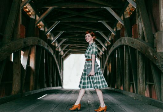
out this photo by Rebecca. When I saw this picture I felt like I found the
modern compilation of Van Dyck’s portrait techniques. First, look at the
horizon line – the visible part of the bridge ends at Rebecca’s knees. With the
low point-of-view, Rebecca looks tall and elegant. Like the portrait of Charles
I, this elegance is paired with a casual air. She is natural and smiling while
mid-walk as if we caught her in-the-moment. This is definitely giving off a
mood – though in this case it’s much more approachable than the arrogant aim of
Van Dyck. She’s even holding a book, which today would just insinuate that
she’s a bookworm. Back in the 17th century, a woman painted with a
book meant that she was actually literate – usually a luxury of the wealthy. And
check out all those diagonals in the background! To top it off, Rebecca is
featuring an element of Van Dyck that I haven’t even mentioned! When painting
women, Van Dyck sometimes used a row of buttons down their dresses to make them
appear long and lean by creating a vertical line. Rebecca’s dress features a
button front, giving just that much more length to her assumed height.
Van
Dyck’s paintings have definitely passed the test of time as it is through his
portraits that Charles I and Henrietta Maria are remembered today.3 He set a new precedent for portraiture, which
court painters followed for years after him. And as you’ve just seen, his
techniques are still relevant to compositions today. If you are interested in
even more ways to optimize your selfies, check out The Clothes Horse’s full
photo tip series here.
Notes:
1. Christopher Brown, Van Dyck (Ithaca, NY: Cornell University Press, 1983), 144.
2. Brown, Van
Dyck, 224.
3. Brown, Van
Dyck, 162.
Resources:
Doot Bokelman, "Art History Survey II" (lecture, Nazareth College, Rochester, NY, Spring 2012).
Doot Bokelman, "17th Century Baroque Art" (lecture, Nazareth College, Rochester, NY, Spring 2014).
Related Recommendations:


 (Ithaca, NY: Cornell University Press, 1983), 144.


A very interesting read.
ReplyDeleteI see that you learned well, Jedi. Hilary T. calls me Yoda. Great job!!!
ReplyDelete